

Take a look around most any Starbucks, doctor’s office waiting room, or anywhere else people incessantly use their smart phones, and you’ll see firsthand that consumers have already gone “all in” on mobile technology. Now, that’s neither surprising nor newsworthy, but heading into 2017, when Google announced that it, too, was going all in on mobile, well, that was big news indeed.
Google subsequently propped changes on January 10 of this year to begin indexing mobile sites (rather than desktop sites) first. This shift served to further underscore the importance of mobile optimization, and it’s caused many marketers to go in search of a more functional understanding of ever-changing mobile best practices as well.
Mobile optimization, at its core, is about delivering a high-quality user experience on any screen size and platform; by isolating central themes including site structure, speed and strategic design elements—“The 3 S’s,” if you will—we can simplify some key components of mobile SEO.
Here are primary considerations for maximizing each of these three mobile SEO components, and why one “S” in particular—speed—is becoming an increasingly important (and controversial) player.
Site Structure
The concept of site structure refers to the technical elements that create the foundation for your website. And, at the heart of this component is perhaps the single most important question marketers must answer when implementing a mobile site:
Should we opt for responsive web design, dynamic serving or separate URLs?
One recent (and reputable) assessment of the different configurations is available here, and you can read Google’s own take on this three-sided debate as well. Bottom line, though: Most agencies and even the search engines themselves now recommend responsive web design, and here’s why:
Responsive formatting automatically adapts content to fit neatly on any size screen being used to display it. But responsive sites also enable marketers to serve the same code on the same URL for both mobile and desktop sites, a clear advantage that creates maximum crawlability for the Googlebot agents that index sites and help elevate SEO rankings.
In large part, those factors are why Google recommends responsive web design, and the combination of maximum searchability and a seamless user experience is why we do, too. Just be sure to round out your site’s programming structure by properly signaling pages that have been optimized for mobile use, and don’t block the search engines from crawling CSS, JavaScript or images, either.
Speed
Motivated by mobile users’ need for speed, Google and Facebook have championed the creation of online publishing formats that are specifically optimized for mobile use. Those formats, called Accelerated Mobile Pages (AMP) and Facebook Instant Articles (FIA), may well be the hot, new acronyms that marketers and content producers need to know.
These AMP and FIA pages are fast—really fast—with pages loading in a fraction of the time it takes traditional mobile sites.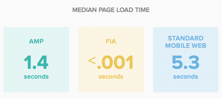
(Source: MarketingLand.com)
The benefits of speed are clear. Less waiting and more accessibility make for a cleaner and more enjoyable mobile experience that consumers love and to which they are more apt to respond. In fact, sites that load quickly engage users for a longer time period than other sites (48 seconds per AMP page vs. 36 seconds for standard mobile) and receive almost 50% more “engagement actions,” which include calls, emails, clicks, form fills and more.
Add to that the fact that Google and other search engines prioritize AMP content in search results, and suddenly, speed is the new must-have component of any mobile SEO strategy. That explains why so many have been quick to adopt AMP, FIA and comparable plug-ins that are available within their content management systems. But there’s controversy swirling regarding AMP and FIA content.
Critics have been vocal and quick to point out that any content—even that of the illegitimate or “fake news” persuasion—can be coded AMP or FIA and receive preferential treatment on the web. That, of course, is bad for credible marketers and content publishers, and is a hurdle with which many mobile SEO strategies must now contend.
Strategic Design Elements
While concise, keyword-driven copy in a well-organized layout, is crucial for any site. High-ranking mobile sites may omit or de-emphasize certain design elements that were once used to amplify the desktop site experience. For example, many interactive elements, pop-ups and interstitials are out for mobile sites, while white space, which is needed so users can touch the screen and scroll up and down pages, is in.
Next, please check out some related reading and learn how to benchmark your current website in the name of SEO success.