

Crafting the perfect email design is both an art and a science, blending creativity with structured best practices to engage readers and drive conversions. Read on as we break down the most important aspects of successful, potent email design, from the most important sections of your email to the obstacles holding you—and your engagement—back.
The basic structure of your email
There is nothing worse than receiving a cluttered email in an already overflowing inbox. Disorganized emails often fall subject to the “delete” click before the consumer reads a word of the message we’re trying to convey. You want to give just enough information to make the consumer follow links for more information or contact you directly.
Element 1: Subject line
With the sheer volume of emails most people receive daily, your message needs to stand out and compel them to click open.
Here’s how to achieve this:
- Ensure your subject lines are concise, aiming for fewer than 60 characters to guarantee full visibility on mobile devices.
- Brief doesn't mean being boring. Spark curiosity or add a touch of personalization to make each recipient feel the message is tailored for them.
- Incorporate action-oriented verbs to propel your audience toward engagement.
- Use numbers and lists to promise a quick, digestible read, enhancing the appeal.
- Steer clear of spammy words that might trigger filters or skepticism.
The promise of value within your email is a powerful motivator for opening it. However, the key to mastering subject lines is relentless testing and optimization. What resonates with one audience may fall flat with another, so continuously refine your approach based on performance data and running A/B tests.
Element 2: Pre-header
As the first snippet of text visible beneath the subject line in the message preview, the pre-header commands a unique position to captivate your audience's attention.
This potential is often underutilized, with many email platforms defaulting to automatically pulling the first line of text from the email as the pre-header if it’s not explicitly set.
Treat your pre-header as an extension of your subject line (or even a second subject line), providing additional value or context that might not fit within the subject line's limited space.
Keeping it concise, around 40 to 50 characters, ensures that the essence of your message is conveyed quickly and effectively, making the pre-header an indispensable tool in your email marketing arsenal.
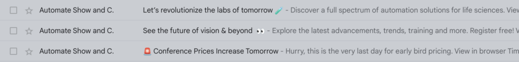
In each of these emails, the preheader text provides more information to entice the click.
Element 3: Main header and navigation
Optimizing the main header and navigation of your email is a strategic move that can significantly enhance the recipient's engagement.
The header should prominently feature your logo, serving as an immediate brand identifier that's both short and sweet.
Maintaining consistency with your website design and overall brand identity in this section is crucial, as it fosters a seamless user experience and reinforces brand recognition.
To further direct your audience, consider incorporating a simplified, website menu-style header. This approach not only guides recipients to other relevant links, enhancing their journey but also declutters the main body of your email, freeing up space to promote additional content.
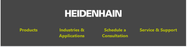
This email header mirrors website navigation for a more dynamic experience.
It’s also important to keep your email’s goal in mind when designing the navigation. For example, if you want prospects to sign up for a free consultation, include that CTA in the navigation.
Element 4: Primary and secondary messages
Crafting emails that resonate with recipients involves effectively balancing and presenting your primary and secondary messages.
At the heart of your email lies the primary message, which is the pivotal reason for your communication and should showcase the inherent value or benefit to the reader. This critical piece should be immediately engaging, comprising a compelling title, one or two vivid images, a succinct message, and a creatively formulated call-to-action (CTA).
Formatting your CTA as a button rather than merely hyperlinked text can significantly boost engagement, steering clear of the uninspiring "click here" for something that captivates and resonates.
Secondary messages, while supportive and less dominant, should seamlessly complement the primary, enhancing the email's message without overshadowing the central call to action.
By adhering to these practices, you create a structured and impactful email experience that clearly communicates your message, encourages engagement, and drives action.
Element 5: Footer
While the footer may not be the most compelling part of an email, it still serves an important role, especially for legal compliance, user transparency and credibility. Some of those elements you need to check off or consider include:
- Unsubscribe link (required)
- Company information (required)
- Contact information
- Privacy policy
- Social media
- Preferences
- Copyright information
- Forward to a friend
Email design and accessibility
If you already have an established email design, it’s important to continually optimize the design to increase click-through rates. There are key technical aspects to keep in mind when designing an email for optimal viewing—some of which have plagued email designers for years.
Responsive email design
In the digital era, where the swipe of a finger on a smartphone screen is the gateway to the world's information, mobile-friendly email design has emerged as a cornerstone of an effective strategy.
The essence of crafting emails that resonate on mobile devices lies in simplifying the user’s journey and embracing fluid layouts and scalable media, ensuring every element adjusts to fit any screen size.
Something as small as your CTA should be designed with ample space to avoid unintended taps (e.g., touch-friendly), and invite engagement.
In addition to these design elements, here’s are more technical considerations to ensure your layout is mobile-optimized:
- CTAs should have a minimum size of 44x44 pixels
- A minimum of 14px for body text and 22px for headings is a good standard
- Most mobile-friendly emails are designed with a maximum width of 600px
- Balance quality and file size by compressing images and using appropriate formats (JPEG for photos, PNG for graphics with transparency) to speed up load times without sacrificing clarity
- Keeping the total email size under 100KB is advisable to prevent slow loading times
- The best width is 500-600 pixels
It’s also important to use programs like Litmus to test your layout design to ensure it renders correctly in your audience’s most popular email clients.
Images
Incorporating images into your email designs effectively enhances engagement and breaks up text, making the overall experience more visually appealing and digestible for your recipient.
Opt for high-quality images, graphics, or even animations and GIFs to captivate your audience and draw them into your content. However, you need to avoid overloading your email with too many images as it can distract from the core message or lead to slower loading times.
Additionally, iconography can offer a clean, organized way to convey your message or highlight key points, further enriching the recipient's experience.
Design for accessibility and readability
Designing your email layouts with accessibility and readability in mind is crucial for reaching a broader audience.
Employing high-contrast styles enhances legibility and adds visual interest, making your content more engaging. Effective use of whitespace is key to avoiding clutter, and ensuring that your message is clear and easy to navigate.
Similarly, choosing high-contrast colors for text and backgrounds significantly improves accessibility for readers with visual impairments, making your emails more inclusive.
Never stop optimizing
The pursuit of the perfect email design is an ongoing journey because perfection doesn't exist. As the digital landscape perpetually shifts, with trends and audience preferences evolving, the need to continuously refine and optimize your email designs becomes imperative.
The dynamic nature of email marketing demands an adaptable approach, where understanding your audience's engagement through tools like heat maps and click maps becomes invaluable. These analytics provide insights into where readers focus their attention within your emails, guiding strategic design adjustments.
Last but not least, always be A/B testing and reviewing your analytics to help refine and adapt your emails to meet the shifting demands of your audience.
Examples of the best email designs
In the quest to craft emails that captivate and convert, we're always on the lookout for design inspiration that strikes the perfect balance between aesthetic appeal and functional simplicity. Platforms like Really Good Emails are a treasure trove of examples that spark creativity and set the bar for what engaging email design looks like.
Here are a few examples our creative team loves. Click or tap each to enlarge.

Slack Frontiers
- Succinct copy and strategic use of scannable elements, such as bullet points and iconography, allows for quick absorption of the event details.
- The unique header image captures interest immediately.
- Prominent call-to-action button commands attention.
- Repeating the CTA at the close of the email reinforces the desired action without overwhelming.
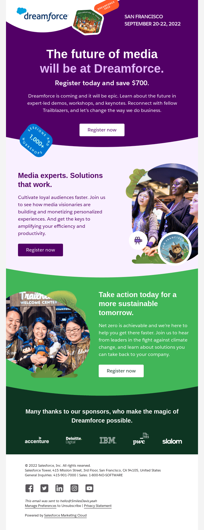
Dreamforce
- Gets to the point with an appealing and straightforward presentation.
- Clean, engaging design smoothly guides the reader.
- Layered visuals create a dynamic feel
- Singular CTA is strategically placed to catch the eye without competing prompts.
- Incentive to save acts as a strong hook, ensuring the main takeaway is immediately clear and compelling.
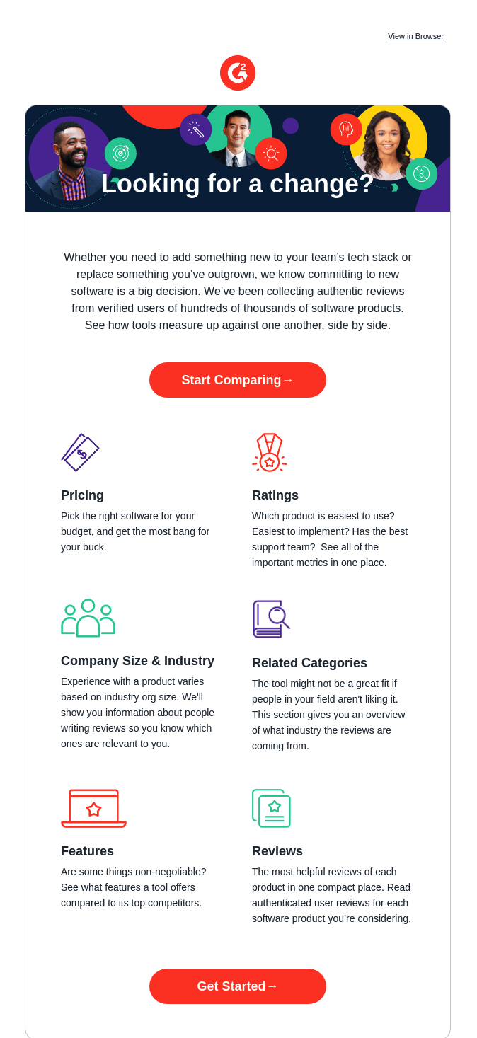
G2
- Messaging is organized clearly and concisely.
- Use of icons create visual interest and drives engagement.
- Strategic CTA placement at top and bottom of email encourages reader to act when he or she is ready.
- Colorful visuals align with branding and elevate the story overall.
Ready to take your email design to the next level?
The art of crafting effective email designs is a crucial component in digital marketing, blending aesthetic appeal with functional clarity to captivate and engage audiences.
As we navigate the ever-changing digital landscape, remember that the journey to perfect email design is ongoing, driven by creativity, strategic planning and a deep understanding of your audience's needs.
Want to transform your emails from overlooked to unmissable? Keen on crafting messages that resonate beyond the click? Reach out and unlock the potential of your email marketing strategy.