
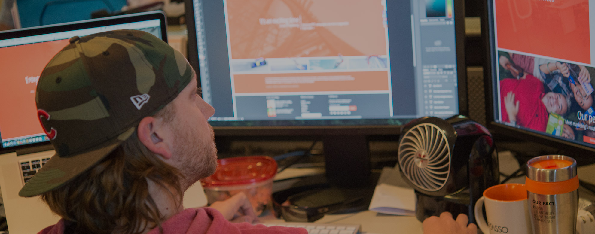
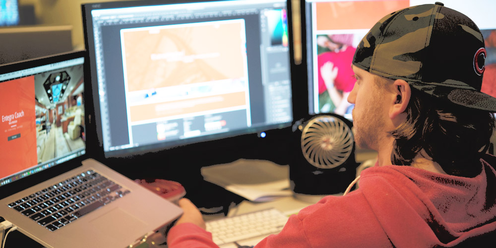
For me, the startup of a new website is insanely exciting—particularly when it’s a website representing the company where I’ve worked for nearly a decade. That’s why, when we set out to build LoSasso’s new website (coming in October!) I knew I wanted to push the limits of modern Web design and programming trends.
Crazy-different (and, fine, maybe exceedingly complex to program) ideas popped into my head. A site that would be so out there, so unexpected, it would go viral. But I am, after all, LoSasso’s digital UX specialist; and the principles of creating a solid user experience never fail to reign me in. My creative challenge is to balance clever, inspiring design and a seamless, user-friendly experience across all devices. And to do that, here’s what I always try to remember:
1. “Cool” is in the eye of the beholder. The foundation of good UX remains largely the same across all audiences. Still, depending on your targets, you may decide that it’s OK to push the boundaries—or not. In the case of our website, the target audience includes some older, potentially less Web-savvy prospects. With every urge to push the envelope, I asked myself if it might be at the cost of frustrating an important segment of our visitors.
2. Not every screen is created equal. Smartphones, tablets, giant desktops and tiny laptops. Browser types galore. And let’s not forget processing speeds. The variables involved in a single website visit can make your head spin. And that’s even more reason to take the time to cover your bases with a seamlessly responsive design.
3. Don’t take familiarity for granted. A crucial element of UX is organizing your content in a familiar, easy to understand way. During our initial concepting, there was some debate over using a standard navigation style or a hidden “hamburger menu.” We loved the simplicity and style of the hamburger menu icon, but was it ubiquitous enough yet for our audience? Would they struggle to navigate and orient themselves? The final compromise wasn’t made lightly.
4. We’re here to delight. UX isn’t all about what’s familiar and intuitive. It’s also about providing an enjoyable encounter. We hope you’ll see that in practice throughout our new site, and particularly on our home page. Checking this off our list required pushing down some of the homepage intro copy, and letting an above-the-fold visual experience and simple headline tell our story.
Countless other UX considerations came into play during development. How can we bring more attention to our site’s rich content without weighing down the simplicity and cleanliness of the concept? In the same vein, how do we accommodate some of the mandatories outlined in the creative brief (a search bar, prominent call-to-action) while maintaining elegance and creative integrity? How can we clearly communicate who we are, without drowning the user in information?
After many brainstorming sessions with the creative and digital teams, sketches of initial concepts, internal reviews and “client” presentations (to our fearless leadership team), we’ve tightened up a concept that appeals strongly to the art director and digital UX stickler in me. As our stellar digital team brings our ideas to life, I can’t wait until we launch—and really show the world what a dynamic and passionate team we are.