I used to think brands chose their colors just by what they thought looked good together. Ever since I became a graphic designer, though, I know otherwise. There are a lot of decisions that go into choosing the right color palette for you and your brand. Who are you trying to attract? What do you want them to feel? How do you stand out from your competition?

Here are five tips to help you out:
1. Know your audience.
You need to know whom you want to attract. What are the demographics and personas of your audience? You probably won’t want to use pinks and yellows if you are representing a law firm, and you wouldn’t expect to see a lot of blacks and reds for a children’s clothing store.
2. Know your competition.
Here’s a good exercise: At the beginning of a branding project, make a color wheel of the competition. Take the top 10 competitors and put dots on a color wheel for each of the colors they used in their logos. This will allow you to see what works for the competition, while also helping you differentiate yourself.
3. Think about psychology.
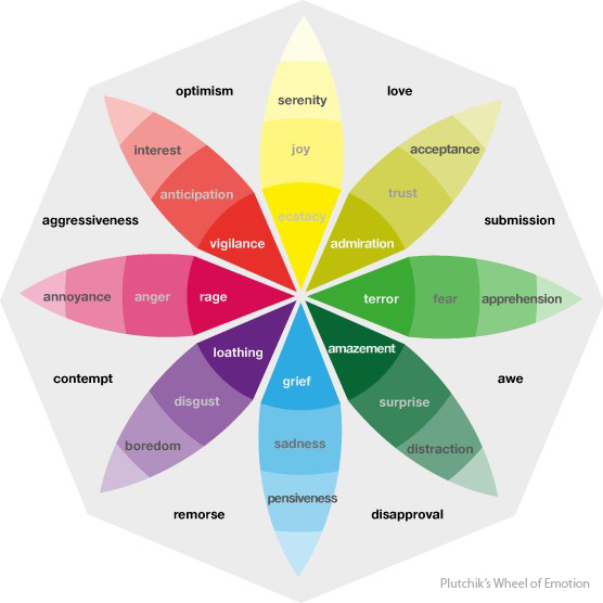
What do the colors you are choosing represent? There are a lot of subconscious reactions to color. Fast food restaurants want to grab your attention and want you to eat a lot and quickly, so they use colors like red and yellow. Red encourages speed, while yellow is often associated with happiness and well-being. On the other hand, credit card companies tend to use a lot of blues with their other colors. Blues give a sense of tranquility, trust and loyalty. Look up some qualities of the colors you are thinking of using to determine whether or not they complement your brand.
4. Don’t go overboard.
Never underestimate simplicity. Watch out for too many colors, or too much going on in your logo. It’s very easy to think, “All of these colors look great together. Why can’t I use all 10 for my brand?” Typically, sticking with two to three base colors is the best way to keep your look cohesive and provide audience cues about your brand.
5. Above all, know your brand.
Go beyond what looks good together and really focus on your brand’s personality. Is it energetic (bright, vibrant colors)? Friendly (warm, welcoming colors)? Edgy (severe, bold colors)? Consider the previous tips, but also consider your own opinions. Don’t let the science behind it drive your entire decision-making process. At the end of the day, it’s your brand and your choice.


