
In the world of design, effective communication is essential. But like in any specialized field, designers have words and phrases that can feel like a different language.
Without a shared vocabulary, misunderstandings arise, leading to more feedback cycles and strained relationships between clients and their creative agencies. Improving your design vocabulary can lead to more effective conversations when working with art directors and designers. We’ve compiled this introductory list of terms to get you up to speed in design lingo.
Type, images and artwork terms
These are usually the first elements that are determined at the start of a design project. The following terms can help you better understand this important first step.
Typography
Typography is the process of designing and arranging text. Key elements of typography include typeface, font size, alignment and hierarchy. These elements come together to reinforce the intended message and maintain a visual aesthetic.
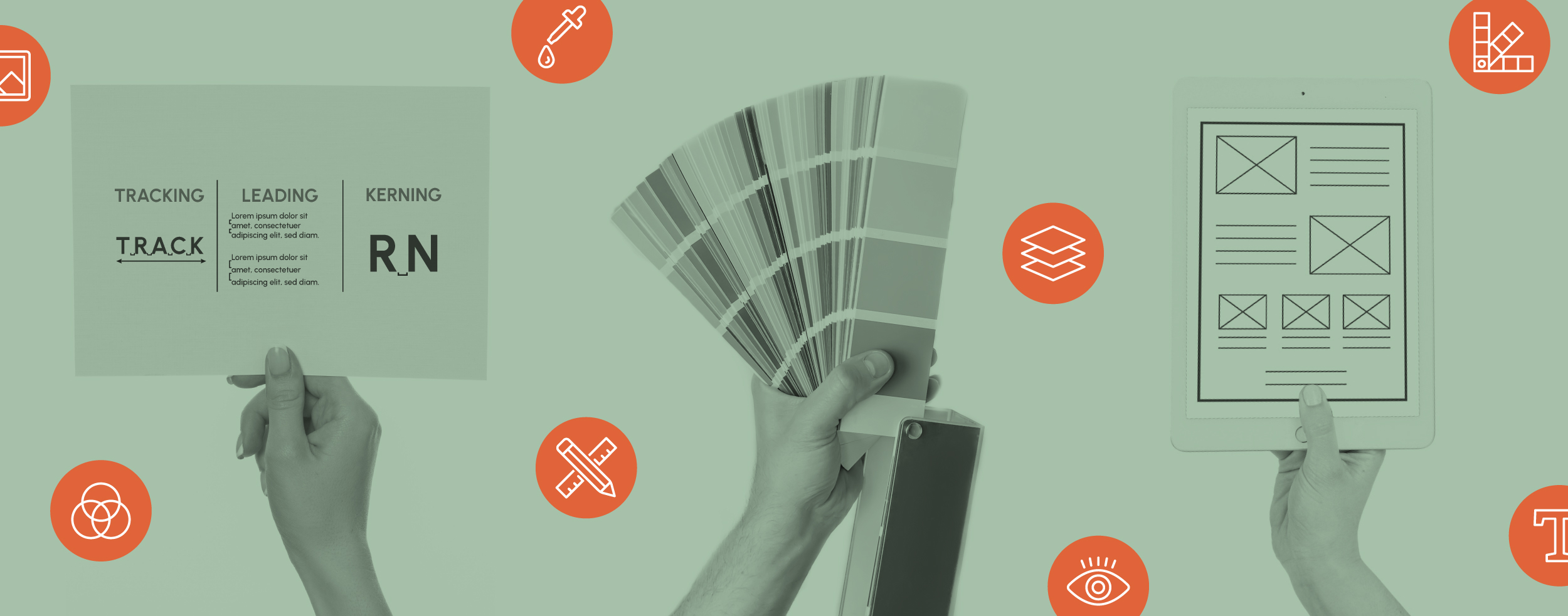
Tracking, leading and kerning
All three of these terms relate to spacing in typography.
- Tracking refers to the horizontal spacing between all letters in a word
- Leading refers to the vertical spacing of lines of text
- Kerning is the adjustment of spacing between two individual letters
Kerning can be extremely precise and is typically used in very specific instances, like logo creation. Tracking on the other hand, is typically reserved for larger amounts of text like headlines or subheads. Leading is an adjustment made to a significant amount of body copy.

Contrast
Contrast is the juxtaposition of different elements working together to create visual interest and help guide the viewer's eye. Contrast can be achieved in many ways, including the use of color, scale or texture.
Pro tip: Instead of a statement like “Make it pop!”, asking for more contrast between elements in a piece can be a more effective way to communicate feedback with your design team.
Opacity
Opacity relates to the transparency of an object or the amount of light that passes through it. A 100% opacity level means the object has no light passing through, making the object completely opaque.

Pixel
A pixel is the smallest, most basic unit of measurement of a digital image. Pixels come together in a grid pattern to create an image. The more pixels an image has, the higher the resolution and detail. That said, pixels cannot be created. This means the resolution of the image cannot be increased (see Raster Images below).
Layout and composition terms
After the images, artwork and type are determined for a project, they need to be arranged successfully. The following terms can help you understand some of the considerations that go into a layout.
Visual hierarchy
Visual hierarchy is the organization of elements in a design to influence the viewer. Many elements come together to successfully create a piece with an effective visual hierarchy, including the following terms.
Alignment
Alignment is the positioning of elements to create a visual order. You may be familiar with right, left and center alignment as it refers to text. Shapes and other elements can also be aligned in these ways. Elements or text can be aligned on their vertical or horizontal axis.

Scale
Scale refers to the size of an object relative to another object. Using scale correctly can achieve balance, emphasis and, as described, visual hierarchy.
Whitespace (or negative space)
In a composition, whitespace is the area or areas left intentionally blank. Even though it is an area without design, whitespace is a crucial element of any composition. Whitespace can strategically emphasize focal points and direct a viewer’s attention to specific messages and visuals in a certain order.
Lorem ipsum
Lorem ipsum (also referred to as Greek text) is a design term for placeholder text. The traditional lorem ipsum passage, based on Latin text, has been specifically created to feel like a natural block of text without including any real words.
Lorem ipsum text can be used as placeholder until copy is available or used to show a layout without actual copy to focus solely on the design.
For Placement Only (FPO)
This is another design term for a placeholder—this time for an image or graphic. FPO can be written over an image or graphic that isn’t finalized or intended to be in the final project.
Mock-up
A mock-up is a representation of an asset displayed in its final form. For example, a common mock-up for an ebook is to show a page or the cover on an iPad. Mock-ups are helpful to visualize a project in the world vs. just on a screen.

File formats and specifications terms
There are many different file formats or specifications needed depending on the type of project and final deliverables.
Cyan Magenta Yellow and blacK (CMYK)
CMYK is the appropriate color space for print projects. Cyan, magenta, yellow and black inks are mixed in a specific formula, or value, to create other colors. When all colors are mixed together, it creates black.
CMYK values are written in parentheses, and separated by commas (e.g., 5, 65, 84, 39).
Red Green Blue (RGB)
This is the color space to use for digital projects. Because colors are viewed on a screen, we use the primary colors of light to make other colors. Red, green and blue lights are added on top of each other at certain values to make other colors. All three lights mixed at equal intensity create white.
RGB values are written in the same way as CMYK, but with only three values (e.g., 5, 65, 84).
Digital color values are also commonly represented by Hex codes. These codes were originally created to identify colors in HTML and other programming languages but are now commonly used across many digital projects. Hex codes are written with a pound sign (#) followed by six letters or numbers (e.g., #0884b5).
When working with brand color palettes, each color should have CMYK and RGB values. This ensures consistency across print and digital materials.

Vector graphics
Vector graphics are digitally created images that are represented by mathematical equations versus pixels. Unlike images made of pixels, the resolution of vector images remains the same when sized up or down, making this format ideal for logos and large printed pieces. Common vector formats include .EPS, .SVG, and .AI.
Raster images
Raster images are built from small squares of color, or pixels (described above). Because raster images are pixel-based, they have a determined resolution and can lose quality or become blurry when scaled up or down. Common raster image formats include .JPG, .PNG, .GIF and .TIFF.
Portable Document Format (PDF)
This is a file format that can be used for a variety of reasons. PDFs preserve formatting and are easily viewed across platforms and operating systems. They are commonly used for marketing materials.
PDFs are also often useful for sharing files with a printer. There are settings available to keep print information at a reasonable file size.
Website design terms
Website design is complex. These terms are not an exhaustive list but are a great starting point for communicating about design for website projects.
Accessibility
Accessibility in web design is the practice of ensuring that a website is accessible for ALL users. A few examples of considerations for accessible web design include:
- Contrast guidelines detail necessary color contrast for text and background colors
- Text should be large enough and in a legible font
- Image alt text should be applied to every image, as this is used to describe the image for those using screen readers
Module
Website modules are a unit or specific component used on a website. Much like building blocks, multiple modules work together to build a webpage. Often modules are reused across multiple site pages for cohesiveness and efficiency.
Responsive
A responsive website will automatically adjust and optimize for different-sized screens and viewports. This means a responsive website viewed on your computer will look different when viewed on your phone or tablet. These differences are generally small changes to ensure the best experience on any device.
User Journey and User Experience (UX)
A user journey refers to the actions taken as a person moves through a website. Similarly, UX refers to the overall experience that a person has on a website.
Wireframe
A wireframe is a simple, low-fidelity representation of a website page. Wireframes can be especially useful to get alignment on a webpage before going into design or programming.

While these terms won’t make you a master designer, they will make you a better communicator. Who knows? Maybe being a better communicator with your designers will save a round of feedback.
At LoSasso, our creative team is chock full of talented designers who are eager to deliver visually stunning work. Learn more about our creative capabilities today!
